
Starry skies: preserve tiny points of light
Plan small areas of untouched paper and build the sky around them to keep stars visible in colored pencil.
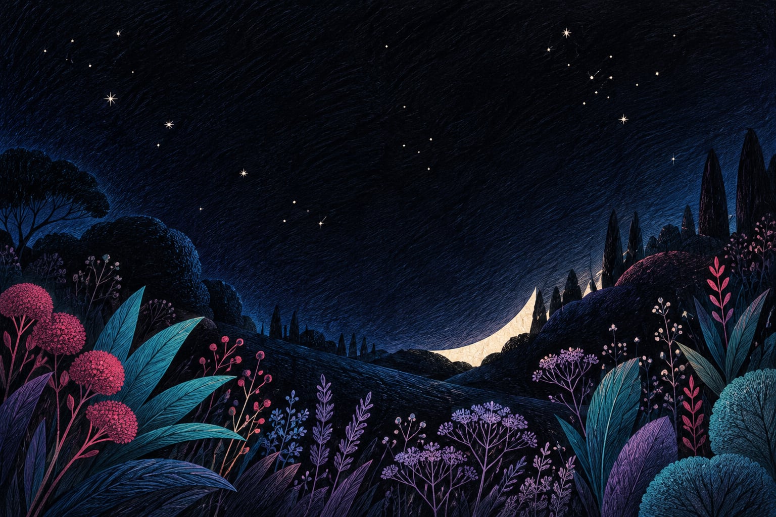
To keep tiny lights in a pencil sky, choose their positions before darkening the area and leave those points uncovered. Practice on a small piece of white paper. The paper itself supplies the light, so this exercise needs no paint, splattering, or product intended to cover the color afterward.
The challenge is keeping a few stars visible while developing the surrounding space. You can try the idea inside a separate rectangle before using it on an illustration with a suitable area of sky.
Plan a few reserved points
Imagine a main group of lights and a few isolated points. Vary the distances between them and leave a larger stretch with no stars. That arrangement is a composition choice for the exercise, rather than an astronomical map. Avoid spacing every point equally if you want a less regular pattern.
Make the reserved areas large enough to work around comfortably with your pencil. If they disappear under the first layer, make them slightly larger next time. You do not need a dark outline around each one; that outline could end up looking like a ring.
Build the sky in sections
- Choose a medium blue and a darker blue you already own. Try both on your practice paper.
- Add a light first layer around the reserved points, working across small areas.
- Approach each point with short, controlled strokes. Turn the paper when that makes the movement easier.
- Add the darker color to parts of the sky while keeping your chosen lights visible.
- Look from a little farther away and decide whether anything needs to be darker. Do not automatically cover every variation in tone.
An example with one leading star
Reserve one slightly larger point and three smaller ones nearby, leaving unequal gaps. Darken the sky beside part of the larger point while keeping a lighter coverage elsewhere. Compare the effect before adding more stars: that small group may already have enough presence.
Getty distinguishes value, meaning how light or dark a color is, from intensity. Here we are concentrating on the difference between light paper and dark sky. You do not need an especially vivid blue to explore that relationship.
Common mistakes
- Darkening everything first: plan the reserved lights before covering the paper.
- Turning every light into a five-pointed star: simple dots may be enough.
- Automatically filling every empty space: leave areas that separate the groups.
- Scraping at a star you have covered: adapt the study and preserve the lights that remain.
A common question
What if my paper is not white?
The reserved points will be the color of the paper. You can explore that result, but it will be a different study. This exercise begins with white paper so the contrast is straightforward to observe.
If imaginary worlds appeal to you, explore the Cosmic Bloom resources. This practice exercise is independent of any specific page in the book.
Conceptual source: Getty's elements of art: value. The star arrangement and working sequence are original suggestions from Equipo Chroma Shu.


Be the first person to leave a little trace of color here.