
Coloring backgrounds that support the picture
Compare untouched paper, a soft halo, and a full background before deciding. Three small tests to support the main subject of your picture.
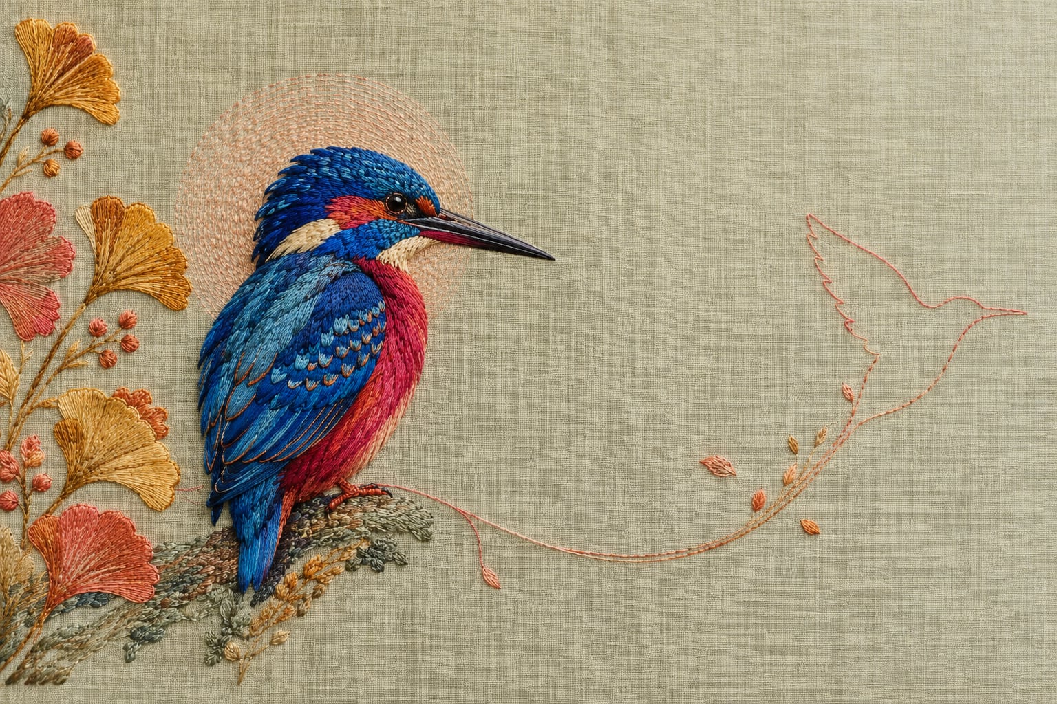
A background can support your picture without covering the whole page: try leaving paper visible, adding a soft halo, or extending a light color around the subject. Compare those options on a small scale before committing to an intense background. The right choice depends on what you want to emphasize, not on how much paper remains uncolored.
After finishing the flowers or characters, it is easy to feel that something is still missing. Sometimes a background helps; sometimes the page already has the balance you wanted. Looking at the relationship between the subject and its surroundings makes that decision easier.
The surrounding space belongs to the picture too
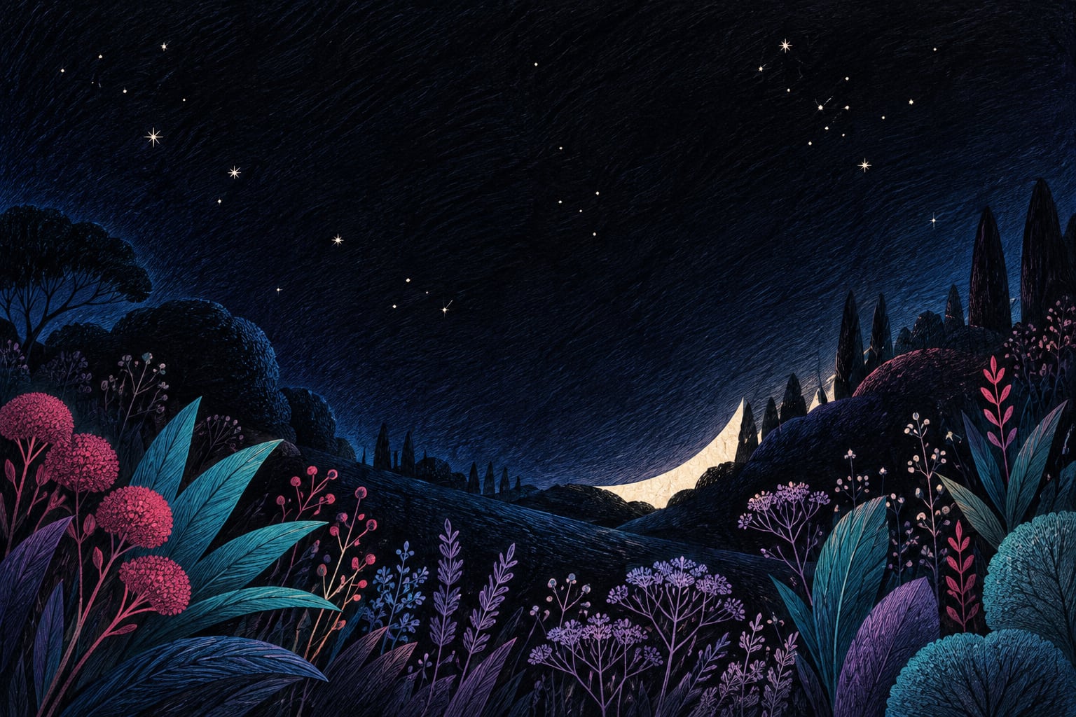
Getty describes negative space as the area around the main objects in an artwork. That does not make it wasted space, and it does not have to stay white. On a coloring page, noticing the shapes between petals, branches, or figures can help you choose where to add color and where to keep a quieter area.
Try three small studies first
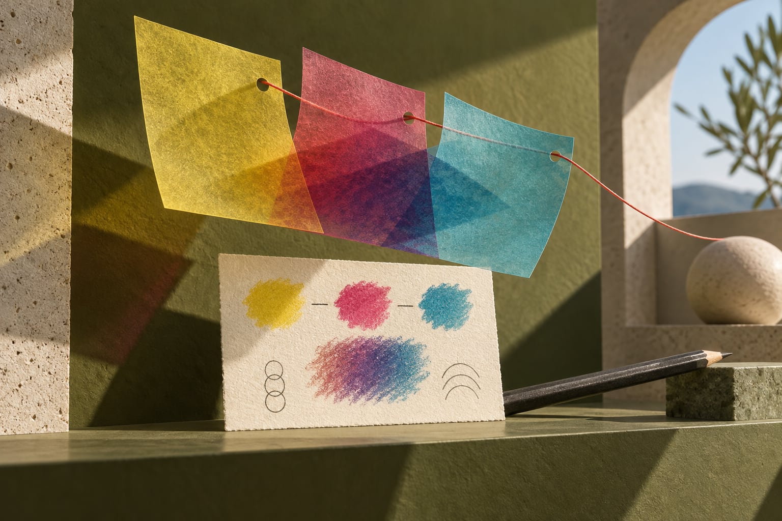
On separate paper, sketch three very simple silhouettes that suggest your subject. You do not need to copy the illustration or finish three complete pictures. Use the same two colors inside each silhouette so that you are comparing backgrounds rather than changing everything at once.
- Visible paper: leave the first silhouette without a background. Check whether its edges are clear and whether you like the sense of space.
- A partial halo: add a soft band of color behind part of the second subject. It does not need to surround the shape like a sticker or form a hard outline.
- A light field: shade the space around the third silhouette lightly. Does the subject still stand out, or does it need a bigger difference between light and dark?
An example with a blue bird
Imagine a bird colored blue and coral. Untouched paper could give it a crisp presence. A peach halo could support those colors without creating another main attraction. A blue background of similar intensity might make some edges disappear. If that is not the effect you want, try a lighter background before darkening the bird.
These combinations are starting points, not universal formulas. Your lighting, paper, and pencils will change how they look. Choose the study you want to bring into your illustration, even if it is the least elaborate one.
Move from the study to the page
With pencils, begin lightly in a small area. Extend it in stages and look at the whole page from a little farther away. Stop before the background attracts more attention than you intended. With markers, test the material on equivalent paper first: covering a large area usually leaves less room to change your mind.
Common mistakes
- Darkening the entire background to fix one awkward patch: first identify which edge actually needs more contrast.
- Choosing a new color for every gap: repeating one can connect separate spaces.
- Treating every uncolored area as unfinished work: visible paper can be a deliberate final choice.
A common question
Is a page unfinished without a background?
No. You can call it finished when the whole picture feels right to you. An elaborate background is equally valid if that is what you enjoy. The studies help you choose deliberately; they are not a rule that every picture should be simpler.
To try the idea, look for an illustration with a recognizable subject and some surrounding space. Explore the Chroma Shu book collection, or practice with our guide to light pencil layers.
Conceptual source: Getty's elements of art: space. The three studies and bird example are original exercises from Equipo Chroma Shu.

Be the first person to leave a little trace of color here.